

|
Back to |
| The Front Page |
| Letters & Opinion |
|
The fun, the feel, the photo |
|
|
Bob Alman's interview with Leo Nikora and Joe Camosy posted April 29, 2007
|
|
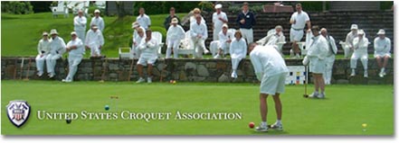
It's the photograph in most advertising and promotion that's most likely to capture your attention and direct it to the product. The managers of the USCA website, newly redesigned and expanded as a result of grant funding, recognized the primary importance of giving first-time viewers of the website an inviting image of the sport of croquet - one they might comfortably imagine themselves in the middle of. They undertook a comprehensive search of the substantial archives of croquet photography, but no single photo, no matter how excellent, told the story. To present an accurate image of USCA croquet, a single tell-all photo would have to be manufacturered! A conversation among founding editor Bob Alman, webmaster Leo Nikora, and photographer Joe Camosy examines the thinking and planning behind the new photographic panorama on the USCA website homepage.
BOB ALMAN: You guys have gotten a great result with a project I was very skeptical about in the beginning, for all sorts of reasons. When I saw Leo's detailed instructions for the photo-shoot, I thought it was going to be impossible for Joe to satisfy the terms - especially because the budget didn't allow for hiring actors. I even regretted that I was going to be responsible for wasting a friend's time by recommending him as the photographer. So I'll begin by asking Leo: How did you come up with that long list of specific requirements, and what made you think Joe was going to be able to pull it off?
LEO NIKORA: I've thought a lot about what attracts people to croquet, especially what is visually attractive about croquet. Working with Jeff Soo on the new USCA website, I discovered that he also had many ideas about it. We often disagreed, but after lengthy discussions, we did hammer out together that long list of specific requirements. Then, with Johnny Mitchell's help, we tried to find an existing photograph the met the requirements. It didn't take us long to realize that such a photograph would have to be professionally created.
|
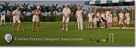
| This photographic panarama is Camosy's final product - the first image seen on the USCA website. For an image comparison CLICK HERE. |
Joe Camosy had already done many of the USCA's stock photographs, and I was impressed with his ability to highlight the fun and friendship of croquet. I wasn't sure anyone could pull off this assignment, but I thought Joe had the best shot (no pun intended). I also liked Joe's willingness to do it all - find the people, organize the photo shoot, retouch the image, and put in the USCA logo and name.
JOE CAMOSY: Thanks, Leo! I was initially intrigued by the idea of creating a home page image for the USCA, as I had already had a lot of fun taking photographs at the National Croquet Center in West Palm, and had even played golf croquet a few times myself. I remember the first time I photographed croquet (Dec 2006) and the challenge that was given to me back then to create images that showed croquet as the real sport that it was.
BOB: All I said was, "Make it look like a sport," and you did. But here's what I was getting at: Leo and Jeff talked a lot about what they wanted to show in the website photograph, and Leo acknowledged that "the perfect photo" had to be created by a professional photographer, but the plain fact is that you came up with a photo that is very, very accurate and very truthful - despite being manufacturered! It looks like a photograph that was produced after you gave precise instructions for a particular situation in a game of Golf Croquet at a local club. And this scene could very reasonably be, in every detail (except maybe the palm trees in the background) the final game of a local one-day tournament at just about any club. Is this the specific "plot" you had in mind, Leo, or did it just miraculously turn out that way?
|
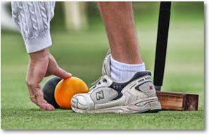
| In his first croquet images, photographer Camosy used various Photoshop techniques to create images that show the grit and tension of a competitive sport. |
So I pretended that all I knew about croquet was its name, that I had typed "croquet" into Google, and then clicked on the fourth listing: United States Croquet Association. What would stop me from pressing the Back button, and looking elsewhere? It would have to be a picture of a person like me having fun playing an outdoor sport in beautiful surroundings A picture showing more than just a kid's game, more than coat-hanger-wire wickets, and more than someone's backyard.

|
| Hitting this link leads you to more specific information, including local club contacts. |
A first-time viewer wouldn't know if it accurately depicted a real game situation or not. They wouldn't know about clubs or tournaments. But the photo should make them wonder why those people are having so much fun. It should pique their interest enough to press the "New-To-Croquet?" button. I think the new picture does just that. My wife, who is not a croquet player, said, "I can see they're having fun, but I don't know why." So maybe we should re-label the button: "Why Are They Having Fun?"
BOB: Actually, that's a pretty good idea. But isn't it amazing that the picture turned out to be so accurate a representation of croquet played at a local club, even though it was so very thoroughly and meticulously "produced" at the National Croquet Center om West Palm Beach, the biggest croquet facility in the world?
LEO: It's to Joe's credit, and to the fact that he has actually played the game, that the picture turned out to be accurate - which also also makes it appealing to croquet players. But accuracy wasn't the main consideration; memorability was more important. Even if viewers didn't look any deeper into the website right then, if the picture could insert itself into their brains as the image association with the word "croquet", then perhaps they might get interested later on.
BOB: A little more on the subject of "accuracy." I was talking about the authenticity of the game situation the photograph depicted, but another "accuracy" issue is the processing - the Photoshopping - of the image, which is irritating to some people and so often overdone. But it's not evident in this case.
|
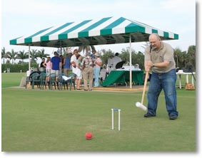
| Photographer Dan Barnett, assisting with the shoot, snapped this scouting shot of Joe Camosy, which includes many of the major elements of the final image. He comments, "Joe and I made two visits to the Croquet Center for test shots before the actual photo session. Several potential scenarios were discussed, photographed, and evaluated before we selected the final scene. A major consideration was fitting all the picture elements into the one-to-three wide angle aspect ratio of the final image. By the day of the shoot we had every aspect pre-planned. We set the cameras in position on tripods and placed the four players on locations marked by poker chips. Nothing was left to chance." |
BOB: I'd like to ask Joe what he thinks of this picture as "public image advertising" and as photography - and I'm not sure there's a useful distinction here, but I know Joe win prizes and awards here and there for "art photography" as well as "live action" photography - that is, not staged or posed or rehearsed - so I have to ask the question...
JOE: My style has evolved over the past few years into what I like to call "slightly" hyper-real or illustrated. It looks like a real photograph, but I try to put something into the image that's a little bit unexpected and so it arrests the attention and holds the eye. Being able to hold or capture the eye of the viewer for an extended period is the holy grail of the visual arts. If the eye can be held long enough, it can result in the viewer experiencing a reverie.
These eye control elements can be created with composition, with subject, color, shading/value etc... and I try to do these things, but an additional technique I often use is to manipulate the "local contrast" of the image in a different way. In my first published photograph, which was the cover of the Kravis Center for the Performing Arts "Playbill" magazine, I used a method for manipulating contrast and value that revealed greater detail than a normal photograph and which gave it an "illustrated" look. There's just something about giving an image a little bit of a painterly or illustrated look that I've always liked.
This illustrated or painterly style actually goes back to the beginnings of photography itself when you had (and still do have!) the two competing schools of Pictorialism and Naturalism. I used to do figure drawing back in the mid 90's, so maybe a part of me still wants to be the painter.
The "Pictorial" style is very much a force in the advertising world today and can be seen in the recent work of photographers such as Annie Liebovitz, Lynn Goldsmith, Jill Greenberg, and Dave Hill, just to name a few. (You can google their names to see some examples of their work)
Of course my stuff is not nearly as over-the-top as these luminaries, but what I try to do is to give my photographs a realism and yet also give them a light touch of something beyond the real. Like a subtle fragrance to be noticed.
BOB: Okay, let me get this clear. I agree the image is arresting. So, ideally, the first-time viewer's eye is captured and held by the image and he goes into a "reverie," according to Joe. In my dictionary, "reverie" is defined as a "daydream." Leo wants people to hit the button as a result of seeing this image. What kind of thoughts and behavior and impact do you envision, Joe, coming from this reverie?
JOE: Well, obviously, the idea is for them to daydream or imagine themselves there at that peak moment, experiencing the excitement and joy of playing croquet and having fun. Another way of putting it, is that the goal was to create a compelling image that pulls in the viewer. If it's also an image that gets the viewer to ask questions, wonder, or be curious about something, then even better. A big part of achieving this, is the idea of the "decisive moment" - some peak action, or human drama that adds interest. The initial scenario for what this action would be, came from Leo.
BOB: Joe, I think you just said the magic word: experience! The final image is really a freeze-frame outtake of the essential experience of sport, isn't it? Any sport. The experience is the thing, and everybody's personal experience is in that picture, whether it's the woman who's going for a long-shot score in a do-or-die situation, or her partner beside her who can easily be imagined saying something like, "You can do it! We can still pull this off!" and is now properly excited that she's on the verge of scoring the tie-breaker. And the opponents - the older couple - know the decisive moment has arrived, that if this shot misses, they'll be able to win easily with the next ball to shoot, the blue ball, right in front of the hoop - and put away the game. And all the spectators are tuned into the moment, the decisive moment, what all the game and all the tournament has led up to, to that point.
Isn't that an accurate way of describing the result you were both after: communicating an actual experience of sport, drawing the first-time viewer into exactly what it feels like? If we could seduce people into the experience shown by that photograph, the popular image of croquet really would completely shift, wouldn't it?
LEO: That's exactly what I wanted the picture to communicate -- how it feels to play croquet. How it feels to be outside in beautiful surroundings, having fun, and making new friends. If Joe hadn't managed to communicate that feeling with his picture, I guess we could have tried an impressionistic painter.
BOB: Not a bad idea. Maybe we should have a contest - in addition to our photo contest. Because, let's face it, one picture can't tell it all. This photo is a kind of common-demoninator image that replaces the earlier image of top-level competition - which probably was a turn-off to some potential social players, and I assume social players are the main target market, just as in tennis and golf. Does Joe's picture actually include the players who are most interested, almost from the beginning, in reaching the top? The pair of teenage twins on the right side of the photo are an example. They've achieved the top tier of competition at the age of 17 by learning to play in their local family club. I wonder if people can see that in the photograph...?
|
| The original USCA website homepage image was a scene from a top-level tournament. For an image comparison CLICK HERE |
LEO: The earlier image did show "top-level competition", which is why we wanted to replace it. But it also showed lots of spectators, which is why we chose that particular image. I'll grant you that those spectators don't look too social, and nobody looks like they were having any fun - except for the drink glass in the lower right corner. I hope that Joe's picture shows both players who will be interested in competition, and players interested in having fun. We need both kinds of players to make croquet more popular. BOB: Which brings up maybe the last question. This website image and the linked information is designed to make people interested enough to get into contact with the USCA, and in the best-case scenario, that means they'll contact a club in the website directory which will welcome them as a visitor, give them a game of golf croquet, and so on. My question is: Are people going to find a welcome at the local club consistent with the spirit of that picture? I know you can't answer that, but I'd like you to answer it anyway, because that's most of the purpose of the website and it's the reason Joe took so much care in creating USCA croquet's "perfect image."
LEO: Most croquet clubs that I know of are very welcoming to new people. My club in Maiu certainly is. I've never been worried that clubs would turn away interested new players, but I've always worried that we weren't getting enough people interested in croquet. I think Joe's picture can help increase interest in croquet.
 LEO NIKORA was born in Washington, D.C., spent his childhood in the hills of West Virginia, and can't remember ever not playing some form of croquet. As an adult, moving steadily westward through many forms of the game, he was taught International Rules croquet by John Taves at the Puget Sound Croquet Club. He now in Hawaii, where he started the Maui Croquet Club. Leo works as Systems Administrator (resident nerd) for the Maui Arts and Cultural Center, where he maintains all their computers, servers, and website. For fun, he also maintains the websites of the Maui Croquet Club, and the United States Croquet Association with Jeff Soo. Leo loves teaching croquet and is now introducing Golf Croquet to his two grandsons Jason and Jesse. |
 JOE CAMOSY enjoys a wide range of photographic subjects, from portraits to wildlife; from events to architecture. A software developer by trade, he took up photography in 2004 after the loss of his wife to cancer. "Photography has been a way to get outside of myself and to experience beauty," Joe says. "To look for beauty, to find it, to create it and to share it - that's my impulse." Camosy continues to advance his skills in image creation by experimenting with various Photoshop techniques, taking portraits of friends, creating unique digital collages, and taking on unusual and challenging projects. Examples of his work can be seen on his website. |